 I'm not sure if it's clear, but Boz and his family reside in a log underwater. That's why the background is a brownish color. In a later version of the Boswald strip, I would abandon the log altogether. Also, the "dots" are supposed to be bubbles.

Wednesday, March 31, 2010
Log Sweet Log
I'm not sure if it's clear, but Boz and his family reside in a log underwater. That's why the background is a brownish color. In a later version of the Boswald strip, I would abandon the log altogether. Also, the "dots" are supposed to be bubbles.
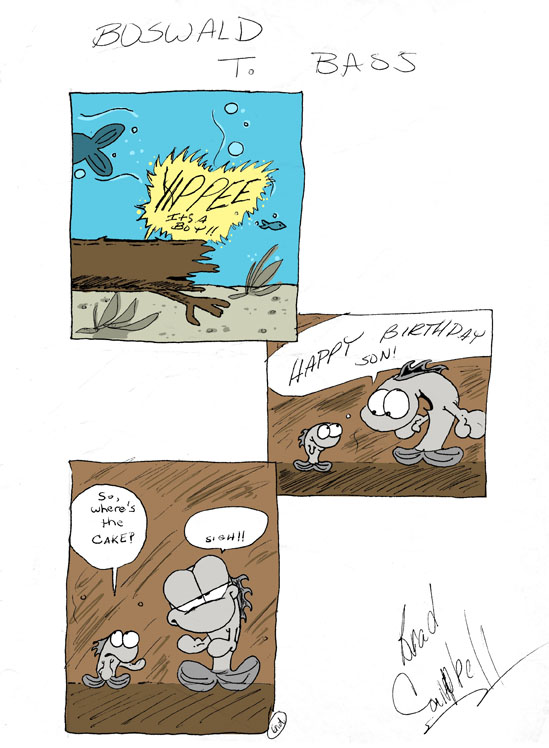
Tuesday, March 30, 2010
Boswald T. Bass: Year One

Boswald went through a few different iterations. This first version of the strip is basically the origin story. The strip begins with the birth of Boswald and prominently features Boz's dad. I guess that's appropriate since my dad was instrumental in creating this comic strip.
Creator Commentary: Similar to Slick, I drew my Boswald comics on ruled notebook paper. I actually inked the artwork, so the original art scanned very well. I decided to enhance the original art slightly. The inks are original, but I decided to color the art. Also, I erased my bad handwriting and replaced it with my personal hand-made font. Lastly, I erased the borders. I think it gives the Boswald strip an open, airy feel.
Monday, March 29, 2010
Boswald T. Bass

Here's another comic strip I did when I was younger (junior high, I think). Keep in mind when I did this comic, I was already doing my Slick comic strip AND a comic strip for the high school paper. I was young and overflowing with creative energy, so I created a third comic strip, Boswald T. Bass. This was a comic strip that was inspired by my dad. He loved fishing and one day he encouraged me to do a comic strip about a bass. If memory serves, he even named Boswald. This is the first sketch/comic that I did featuring Boswald.
Sunday, March 28, 2010
Slick And Pals: Before and After


Creator Commentary: So why go to all the trouble of inking and coloring some crusty old drawings? I have a history with this character. I started drawing Slick in elementary school, continued it through junior high, high school and even college. Looking back, I cherish this comic strip. This strip helped me develop my humor, writing, and art style. The early strips posted here aren't very good (I was 11 for Pete's sake!), but the strip gradually developed over the years and got better. The work I did on Slick helped shape me into the cartoonist I am today. And I'm pretty proud of that.
Sundays with Slick

When I drew Slick and Pals, I did both dailies and Sundays. For those not in the know, dailies are comics that appear on weekdays, and Sundays are comics that appear in the Sunday paper. At 11 years old, I was cranking out more work than I do now. Of course, I had a lot more time on my hands in those days.
Saturday, March 27, 2010
Shades of Heathcliff
 I modeled Slick's cool and confident personality after the comic strip character, Heathcliff. Unlike Garfield, Heathcliff was a badass. I don't like Garfield anymore, but Heathcliff rocks. (I'm referring to classic Heathcliff by creator Geo Gately.) The artwork is gorgeous and the strip is very action-packed and energetic (especially the Sunday strips). If you look at Slick's expression in the second and third panels, you'll see shades of Heathcliff.
Friday, March 26, 2010
I'm Super, Thanks for Asking
 Doing this comic strip was a learning process. I was still learning the proper way to draw a comic strip. In most comics, the lettering is in all caps. In this strip, the lettering is all over the place. It would be easy to correct this when I'm re-inking these strips, but I want to preserve the mistakes that I made along the way.
Thursday, March 25, 2010
Of Mice and Men
 All the characters in Slick and Pals were pretty well defined. Slick was cool and confident. Trembley was nervous. Jake was always annoyed at his pets. However, I never did much with Eek the Mouse. At one point in the comic strip, I decided to make him chew things alot (kinda how real mice chew things) and I renamed him Chopper.
I did this strip in 1986. In 1992, the Saturday morning cartoon, Eek the Cat, debuted. I remember getting mad because I felt ripped off, but that feeling wore off because Eek the Cat was an awesome show and I watched it all the time.
Wednesday, March 24, 2010
Bath Time Bathos
 I was even mimicking Jim Davis' layout techniques. I'll explain. In every Garfield comic strip, the first and last panels have a border. The middle or second panel is always borderless. Later, I stopped doing this and switched to a two panel format for the strip. Even later, I went back to three panels (all with borders).
Tuesday, March 23, 2010
Trembley, The World's Most High-Strung Cat
 As an artist, it's easy to look back at this old comic strip and dismiss it as a Garfield clone. However, I was only 11 years old. I didn't have much life experience to draw from, so I was simply imitating my favorite comics strips. At least, I made an effort to create my own characters instead of just drawing other cartoon characters.
Monday, March 22, 2010
Slick And Pals
 Since last week I posted samples of my Roofus comic strip, this week I'm posting samples of my very first comic strip, Slick. Early in my life, I knew I wanted to draw comic strips. As a kid, one of my favorite strips was Garfield. Today, I'm not the biggest fan, but I can't deny that Garfield was a big influence on me. This comic strip is called Slick and Pals. The main character, Slick, is one cool customer. He's a cross between Garfield and Heathcliff (another favorite) except he's a dog. Trembley is a mute, scaredy cat. Eek is a cute but mischievous mouse. Jake Armstrong is the owner of all these crazy pets.
Creator Commentary: I did this comic strip in sixth grade, so I didn't use the best materials. I drew the comics in a single subject notebook on ruled paper using pencil only (no inks). When I was preparing these strips for my blog, I scanned them in and decided to re-ink them using my Wacom. I kept the inks loose to retain my sloppy sixth grade line quality. Since I've been on a coloring kick, I decided to add a splash of color just for the heck of it.
Sunday, March 21, 2010
Luck of the Draw Part Two
 Here's the final design of the leprechaun. Eventually, I made him look very cartoony and very animated. I wanted him to look slightly different in style than Roofus. It's very subtle but it's intentional. He was fun to draw. Maybe one day he will return to the panels of Roofus. If we're lucky. Once more, here's Roofus' Leprechuan storyline collected together.


Saturday, March 20, 2010
Luck of the Draw Part One

From the pages of my Roofus sketchbook, here are some sketches and character designs of the little leprechaun from this week's Roofus storyline. When I was writing this storyline, I realized, "Oh crap. I've never drawn a leprechaun before." I knew I had to do some preliminary designs to work out the details of how he should look. If memory serves, I probably referenced the classic Chuck Jones cartoon, The Wearing of the Grin. This cartoon features Porky Pig being harassed by a couple of crazy leprechauns.
Friday, March 19, 2010
Seasonal Conspiracy
 So was the leprechaun REAL? Or was the whole thing a delusion brought on by lack of sleep? The fun thing about this storyline is that it's up to the reader to decide.
Creator Commentary: This is a nice discussion that serves as an epilogue to the leprechaun story. Dialogue scenes like this is another recurring device that I employ in the Roofus strip. These scenes give the reader insight into who these characters are and how they interact with each other. I think a good epilogue should bring closure to the storyline, not only for the characters but the audience as well. Having said that, this one's pretty weak.
Thursday, March 18, 2010
Wish Fulfillment
 In the third panel, he's checking to see if the coast if clear (he's bashful). He clearly loves to jig and he is self-conscious about it. I thought about adding dialogue to the final panel, but to me, it's way funnier without it. And it calls back to yesterday's strip.
Creator Commentary: I loved drawing this leprechaun character. I never used him beyond this storyline. One day, I'll have to bring him back. He has a very animated, loose quality about him that doesn't quite fit the style of the Roofus strip. I think that's appropriate since he's a mythical creature or possibly a figment of Roofus' overactive imagination.
Wednesday, March 17, 2010
Gettin' Jiggy With It

I really like the third panel.
Creator Commentary: This is a recurring theme in the Roofus strip. He's always stressing out over finals and midterms (to the point that he becomes delusional). The font I'm using in the strip is a new custom-made font based on my own handwriting. I love this font. It gives the strip a more hand-crafted, unique look. Using a font is SO much quicker than lettering by hand. Also, using a font gives you the freedom to easily rewrite and edit dialogue (this is especially necessary in humor writing). Making the font was easy and very FREE. Check it out at www.yourfonts.com.
Tuesday, March 16, 2010
Luck of the Spastic

Creator Commentary: Roofus was originally published in black and white, so I decided to experiment with some color. Since the strips featured this week have a St. Patty's theme, I chose a palette of various greens. I also am trying out a new shading technique that I learned from tutorial by PVP cartoonist, Scott Kurtz. I'm extremely happy with the results.
Monday, March 15, 2010
Midterm Madness

In honor of the Irish, this is a Roofus storyline with a St. Patrick's Day theme. Since midterms usually coincide with St. Patty's Day, I thought I'd combine the two. Plus, I love doing holiday themed comics. I know, I know. This particular strip isn't very Irish. Tune in tomorrow for more St. Patrick Madness.
Creator Commentary: This strip establishes that it's midterm week for Roofus. Usually, a Roofus strip is three or four panels. I experimented here and did one long panel without a border. Then, I used his scream as a background image to emphasize his stress level.
Sunday, March 14, 2010
Roofus Sketchbook Part Two
 Here are some more Roofus sketches. These are movie/comic book parodies. I like the Roofus version of the Batman symbol. I also like the Hulk transformation sketch. I don't know why I did the Spawn sketch. I hate that character.
Saturday, March 13, 2010
Roofus Sketchbook Part One
 Here's some Roofus sketches. The Country Club Roofus is an idea that I've had for a while. I want to do a storyline where Roofus joins a country club. I'm aching to make fun of this elitist group of snobbish people, but I need to do some research first. I also love the "inappropriate" hulk joke. I like adjective humor.
Friday, March 12, 2010
Weird drawing app

Pretty trippy web drawing app here, just click and drag. I "drew" this in about a minute. It's fun Try it. http://mrdoob.com/projects/harmony/
Maggie Moo's Ice Cream and Flu Shots


Thursday, March 11, 2010
I Second that Emoticon

This was a magazine illustration that accompanied a feature story about internet dating. I'm happy with the final result, but looking back, today I would have taken a different approach with this one. Instead of drawing by hand, I think it would have been more appropriate to create this in Illustrator using a vector-y, more graphic look. I do however like the flat look of the final product and the colors by Matt Beckham are exquisite.
Evolution of a Sketch: Below is a good example of the evolution of an idea into a fully, realized drawing. I knew I wanted this drawing to have a flat, simple look. The first sketch below was a good idea, but it didn't capture the dating aspect of the story. The second sketch was cute (subbing the cursor arrow for cupid's arrow) but I wanted something more adult in tone. My idea began to solidify with the third sketch. This one captured the love connection aspect of the story. With the fourth sketch, I decided a close-up is better and I designed the details of the lovers' faces. With the fifth sketch, I framed the couple with a computer monitor and added a keyboard. Even at the inking stage, revisions are made. I slightly poked the couple's heads out of the monitor to add some depth. The final touch: flirty emoticons.


Wednesday, March 10, 2010


Tuesday, March 9, 2010
As the Crow Flies


Here's another magazine illustration. In this column, the writer was trying to determine the exact definition of the expression, "As the crow flies." At one point, she mentioned that she should dress up in a trenchcoat, go to the bad side of the tracks and bribe a crow with bird seed for the crow's flight path. I think the final illustration does an excellent job of illustrating that scene. I love this drawing. I'm usually my worst critic, but this is one of those rare exceptions in which I'm completely happy with the final result.

Here's the first sketch. I was trying to work out the final design of how the crow should look. I drew him sitting on a crate. I didn't like his sitting pose.

The columnist mentioned the city council having a meeting and voting on the exact distance as the crow flies. For local readers, yes, that is Mayor Cedric Glover. Also, I love the "Old Crow" joke.

I really liked this version of the crow. He was starting to look more like a Warner Brothers character to me, which was my goal. I liked the scarecrow, but I thought it was too distracting.

Subscribe to:
Posts (Atom)